

Metallic printable films, especially gold chrome, can be breathtaking when done right, but they’re also notoriously tricky to print on. Many designers find their artwork looks dull or washed out because the reflective surface interacts differently with inks and light.
To help you make your gold chrome printable pop, here are some creative and technical tips for achieving a stunning, high-impact result on your next graphic design:
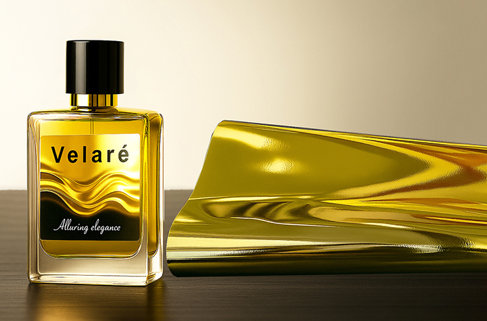
1. Use High-Contrast, Minimalist Designs
Gold chrome is a star on its own, so treat the gold as part of your artwork.
Try:
- Deep, rich colors like black or navy blue for a luxurious contrast.
- Small touches of white or bright highlights for visual balance.
- Bold typography or geometric shapes instead of detailed photos.
Avoid: full-color images and soft gradients, as the metallic surface can distort tones and reduce clarity.
2. Let the Gold Show Through
Don’t cover the gold, use it!
Tips:
- Design vector graphics with transparent areas so the metallic surface can shine through elements like borders, outlines, or logos.
- Use negative space intentionally - gold reflections around matte prints create elegant depth.
- Think of the layout as a spot varnish design - selective coverage looks more premium than full saturation.
3. Choose a Color Palette That Complements Gold
Certain colors amplify metallic gold, while others clashes, dark, saturated hues make the gold’s reflection stronger and more vibrant:
Colors work best: Black, Charcoal, Deep Blue, Indigo, Burgundy, Maroon, Emrald Green
Colors to avoid: Beige, Brown, Yellow, Orange, Light Pink, Pastel tones
4. Design for a “Luxury” or “Premium” Feel
Gold chrome naturally conveys sophistication, lean into it. If you are creating premium brand label, ideas for layouts:
- A matte black background with your logo in white and unprinted gold accents.
- Abstract metallic patterns or wavy gradients that play with light.
- A product silhouette in black, with gold outlining or glow effects for drama.
5. Avoid Soft or Subtle Images
Photographic images, especially skin tones or soft blends, tend to lose definition on metallic films.
If you must use photos:
- Convert them into duotone or halftone images for a stylized effect.
- Apply black overlays or gradient masks to control reflections and maintain contrast.
Bonus Tip: Perfecting the Print Setup
When preparing files for print:
- Use selective opacity - avoid solid CMYK white unless necessary.
- Experiment with white ink underlays in your RIP software: print white only under areas needing true color, leaving the rest transparent so the gold shines through naturally.
Final Thoughts
Metallic gold chrome can elevate your design from simple to spectacular — when treated with care. By embracing contrast, negative space, and selective printing, you can turn reflective surfaces into your creative ally instead of your enemy.
Gold isn’t just a color, it’s a statement. Make it shine with Graphictac's Gold chrome printable.